
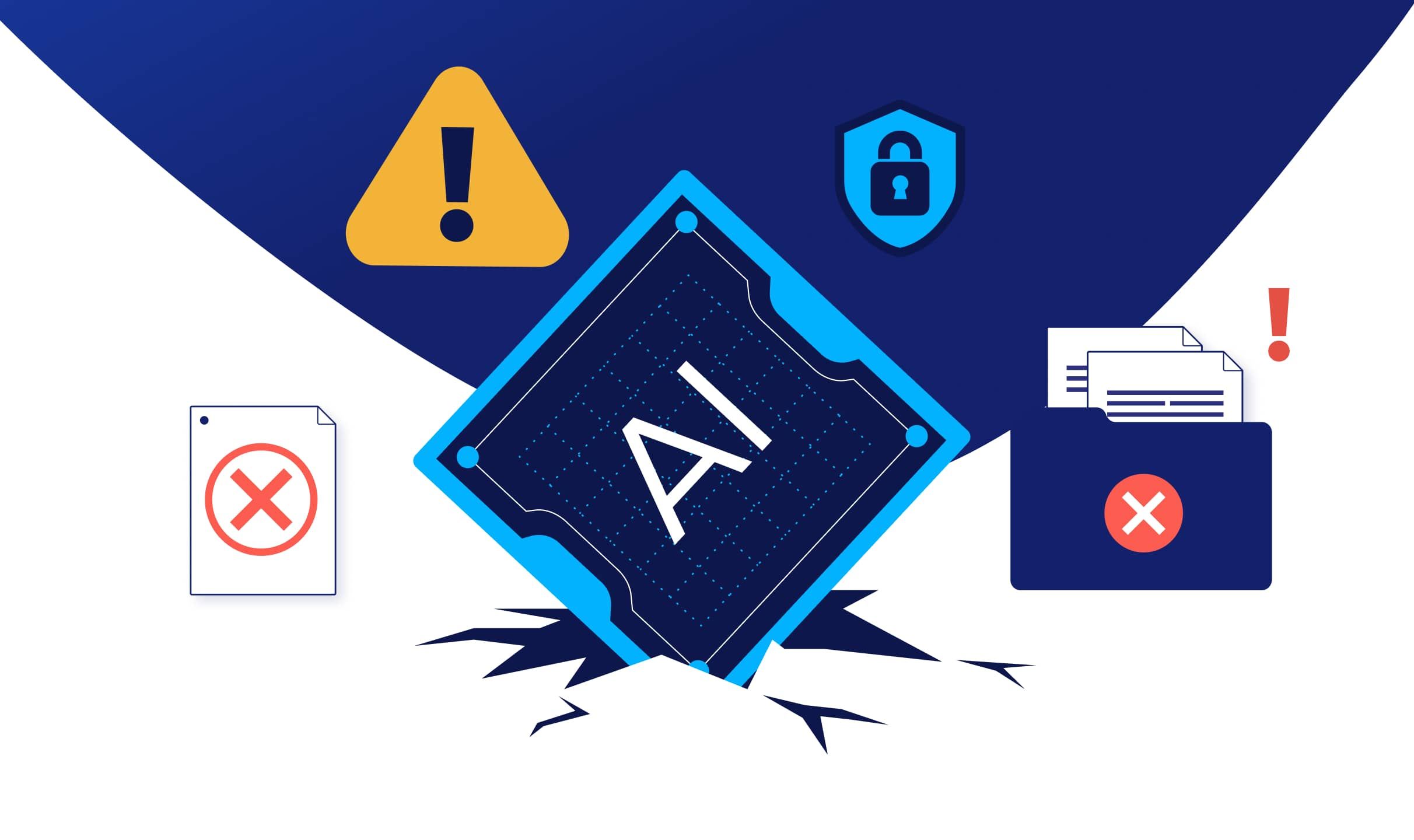
CVE-2025-55182: Critical RCE Vulnerability in React Server Components
A critical Remote Code Execution vulnerability affects React Server Components in Next.js 15.x and 16.x applications. Learn about the exploit, impact, and how to patch immediately.
Recent Posts

Government Technology
Securing Your ArcGIS Maps: A Government IT Director's Guide to Preventing Accidental Data Exposure

Web Security
How Spammers Exploit CloudFlare Zero Trust to Bypass Bot Protection (And How We Stopped Them)

Web Security
Understanding the Gravity Forms Security Incident: Lessons in Supply Chain Security

Technology Strategy
How AI Has Flipped the Buy vs Build Equation
Security
5 min read
CVE-2025-55182: Critical RCE Vulnerability in React Server Components

Brad Anderson
Founder
Government Technology
5 min read
Securing Your ArcGIS Maps: A Government IT Director's Guide to Preventing Accidental Data Exposure

Tony Diaz
Service Desk Lead
Web Security
5 min read
How Spammers Exploit CloudFlare Zero Trust to Bypass Bot Protection (And How We Stopped Them)
Tony Diaz
Service Desk Lead
Web Security
5 min read
Understanding the Gravity Forms Security Incident: Lessons in Supply Chain Security
Brad Anderson
CTO/Founder
Web Security
5 min read
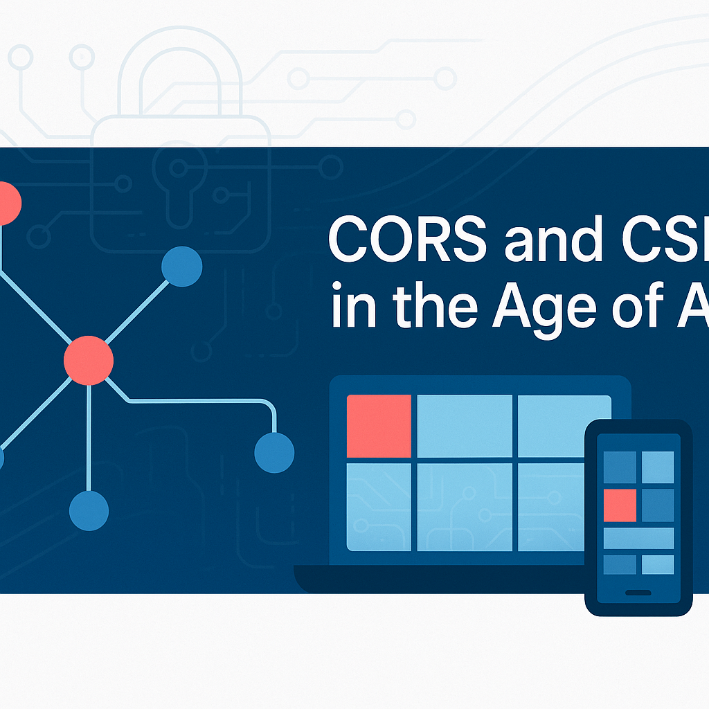
CORS and CSP in the Age of AI: Why These Security Policies Are More Critical Than Ever
Tony Diaz
Service Desk Lead

|
5 min read
Behind the Biz: A Deep Dive into the Success of C Lazy U Ranch with Brady Johnson

Lynne Craig
VP of Digital Marketing


Get the latest from Fruition
Government Technology
5 min read
Government CMS Modernization: A Complete Guide for Federal, State, and Local Agencies
Tony Diaz
Public Sector Technology Consultants
|
5 min read
AI for Content Creation: Top 10 Mistakes and How to Avoid Them

Emily Fournier
Director of Creative Strategy

|
5 min read
Fruition Achieves SOC2 and ISO 27001 Certifications with HIPAA Compliance Endorsement
Brad Anderson
Founder

|
5 min read
Outsource Digital Marketing with Confidence: A CEO’s Guide to Overcoming Common Challenges

Jim Collins
CEO